 |
|


 Sep 12, 2005, 03:01 PM // 15:01
|
#1 |
|
Academy Page
Join Date: Jun 2005
Guild: Allies of Inverness
Profession: R/E
|
 My first wallpaper!
This is my first wallaper, i made this one for my guild.
Maybe u think the text looks a little weird (Demonic Redeyes text), but i have a answer. I created the text and then I made it bigger, low texturized... Pls, dont diss this totally, have in mind this is my first one  Notice the red eyes on the skull^^ Notice the red eyes on the skull^^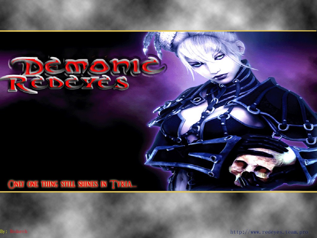 Edit: i dont have a thumbnail or anythin, don get mad for the big size, maybe any MOD can fix this
Last edited by POurab; Sep 12, 2005 at 03:03 PM // 15:03.. |

|

|
|
Sep 12, 2005, 03:10 PM // 15:10
|
#2 |
|
Frost Gate Guardian
Join Date: Jul 2005
Location: The Netherlands
Guild: Resistance is Painfull[RiP]
Profession: A/Me
|
Pretty cool for your first one. Still need to work on the texture though.
But i think u will manage when having some practice. Great job 
|
|
|
|
|
Sep 12, 2005, 03:39 PM // 15:39
|
#3 |
|
Academy Page
Join Date: Jun 2005
Guild: Allies of Inverness
Profession: R/E
|
Thank u, that really is really motivating!
|
|
|
|
|
Sep 15, 2005, 04:19 AM // 04:19
|
#4 |
|
Krytan Explorer
Join Date: Aug 2005
Location: Long Island
Guild: So Goth We Crap [Bats]
|
Well seeing as this is your first, just know all constructive criticism lol.
First thing is color. The grey/purple/yellow/red clashes with each other, so it is always better to do a bit of research and testing to see what looks right. A helpful site for that- http://www.liquisoft.com/colortheory.html The cloud effect for the background would look better if it was also purple, or a matching shade. Typo is the hardest aspect of designing at first and usually still is to most pro designers. To get the text to look right and flow with the entire image takes time so don't let the discourage you too much. With the text you chose, being red and vibrant, doesn't really match the cool, purple backround or the image itself. Also the By- lkdfdf and address at the bottom (don't take this too hard) looks dredful lol. The image itself would look a whole lot better if you simply left the two out all together. Also, text doesn't have to have every effect photoshop has to offer, simple is ALWAYS better! Haven't critiqued graphics in a long time soo take my advice or not, all constructive criticism  PS- www.deviantart.com You will see some of the best graphics and designers on the web there. Browse around. Last edited by NekoZ; Sep 15, 2005 at 04:21 AM // 04:21.. |
|
|
|
|
Sep 15, 2005, 04:21 AM // 04:21
|
#5 |
|
Frost Gate Guardian
Join Date: Jun 2005
Guild: Black Rose Sanctuary
Profession: N/Me
|
not bad looks good for a first run
|
|
|
|
|
Sep 15, 2005, 05:04 AM // 05:04
|
#6 |
|
Wilds Pathfinder
Join Date: Apr 2005
Profession: Mo/
|
Well if you want it as a wallpaper then you need a few more things than just an appealing picture. You need to make sure that your icons don't intrude on your picture or become hard to read. Whenever I'm looking for a new wallpaper I often decline the cooler looking pictures in favor of a well laid out picture.
I guess you could always use the Start Menu to its full potential. |
|
|
|
|
Sep 15, 2005, 05:46 AM // 05:46
|
#7 |
|
Academy Page
Join Date: Jun 2005
Guild: Allies of Inverness
Profession: R/E
|
i don't need to see icons. I use objectdock
TY nekoz, i'll keep that in mind... thx for the "good" critism
|
|
|
|
|
Sep 15, 2005, 12:09 PM // 12:09
|
#8 |
|
There is no spoon.
Join Date: Jun 2005
Location: Netherlands
Profession: Mo/
|
No offence, but everyone could make this.
|
|
|
|
|
Sep 15, 2005, 02:35 PM // 14:35
|
#9 |
|
Academy Page
Join Date: Jun 2005
Guild: Allies of Inverness
Profession: R/E
|
i guess, it's my first one, "a everyone can do this" thing... i got the critisicism and I will make much better.... duuuuh...
|
|
|
|
|
Sep 15, 2005, 04:06 PM // 16:06
|
#10 |
|
Lion's Arch Merchant
Join Date: Apr 2005
Location: The Frozen plains.
Guild: The Llanowar Legion [LL]
Profession: Me/N
|
About the layout:
the idea is good. If I were you I'd make the top and bottom part an equal height and I would make them slightly transparant, or brush on them with some nice brushes instead of just using a "render clouds" filter. Colors: I would give it more color, or more matching colors, the top and bottom parts have a yellow stroke, yellow doesn't really fit in with the rest the only yellow thing is the outer glow on the "Only one hting still shines in Tyria" and "by" text. Also the red and purple clash, changing the font color is easiest I guess, the easiest way to find a color that is similair or doesn't clash is just go to the color picker in PS and select a color similair to the other ones, just like select the purpler color in the background, and make it a bit lighter or darker purple for the text etc. I would also decrease the bevel on that "Demonic Redeyes" font. I'll make an example of what I mean XD |
|
|
|
|
Sep 15, 2005, 04:44 PM // 16:44
|
#11 |
|
Academy Page
Join Date: Jun 2005
Guild: Allies of Inverness
Profession: R/E
|
good, w8ing for that example!
|
|
|
|
|
Sep 15, 2005, 05:39 PM // 17:39
|
#12 |
|
Lion's Arch Merchant
Join Date: Apr 2005
Location: The Frozen plains.
Guild: The Llanowar Legion [LL]
Profession: Me/N
|
Since it's against the forum rules to post a pic so wide I'll link it.
I've just whiped it up in like 10 minutes so don't expect too much of it. Example can be found here What I did was cutout the Necromancer image. Then put a background behind it, also a GW one, on top of that I made a layer that I linked to it with a similair purple color, and just changed it's opacity. You can also go to adjust the layer and choose color balance. Then I made a layer on top of them all with the 2 bars, both 150px high, I changed the opacity to a slight bit lower so you can see the necromancer underneath it slightly. Then I roughly brushed over it.. that's prolly the worst brushing I've ever done but oh well.. I put a pattern over the Necromancer of a scanline (simply made by creating a new image 2x1, one pixel black other transparent, define pattern) and lowered it's opacity to like 20%. The font, chose a font changed blending mode to overlay, use scanline pattern on it aswel to make it slightly darker, a black 2px stroke and inner glow to make it slightly more clear. as for the quote chose the visitor pixelfont, I like it personally with quotes, and just gave it a color and a 1px black stroke. hope this helps >.> |
|
|
|
|
Sep 15, 2005, 06:03 PM // 18:03
|
#13 |
|
Academy Page
Join Date: Jun 2005
Guild: Allies of Inverness
Profession: R/E
|
OMG! This is super... may i upload it to my guild website as an official unofficial gerbill made super wallpaper??
One little noobish question; How do u cutout so nice? do u use magnetic lasso or something? And u said, 2x1 something one pixel black and one transparent, but how do I cover the hole main picture(wallpaper) with it?? Last edited by POurab; Sep 15, 2005 at 06:08 PM // 18:08.. |
|
|
|
|
Sep 15, 2005, 06:08 PM // 18:08
|
#14 |
|
Lion's Arch Merchant
Join Date: Apr 2005
Location: The Frozen plains.
Guild: The Llanowar Legion [LL]
Profession: Me/N
|
lol sure.. but if you want to learn all the wallpaper photoshop stuff.. look at the tips and how I done it, that should give you some general ideas on how to make stuff look fancy in a short time.
|
|
|
|
|
Sep 15, 2005, 06:17 PM // 18:17
|
#15 |
|
Academy Page
Join Date: Jun 2005
Guild: Allies of Inverness
Profession: R/E
|
well thank u very much! Soon u will see some results, but i dont have time today or yesterday, but on sunday a wallppr will be shown!
|
|
|
|
|
Sep 15, 2005, 08:39 PM // 20:39
|
#16 |
|
Academy Page
Join Date: Jun 2005
Guild: Allies of Inverness
Profession: R/E
|
i lied.. XD
Here's my newest wallppr! Hope it's good Gerbill, tried all ure tricks http://web.comhem.se/~u18227669/dddd.jpg |
|
|
|
|
Sep 15, 2005, 08:58 PM // 20:58
|
#17 |
|
Lion's Arch Merchant
Join Date: Apr 2005
Location: The Frozen plains.
Guild: The Llanowar Legion [LL]
Profession: Me/N
|
It still needs some tweaking but it looks a lot better than your previous one in my opinion.
when you're in adding the pattern to a layer, lower the opacity, now they're a bit too stripey. |
|
|
|
|
Sep 15, 2005, 11:35 PM // 23:35
|
#18 |
|
Academy Page
Join Date: Aug 2005
Location: lethbridge ab canada
Profession: W/Mo
|
good job!
|
|
|
|
|
Sep 16, 2005, 05:20 AM // 05:20
|
#19 |
|
Academy Page
Join Date: Jun 2005
Guild: Allies of Inverness
Profession: R/E
|
okey, got it. What font did u use for the qoute??
|
|
|
|
|
Sep 16, 2005, 06:53 AM // 06:53
|
#20 |
|
Lion's Arch Merchant
Join Date: Apr 2005
Location: The Frozen plains.
Guild: The Llanowar Legion [LL]
Profession: Me/N
|
"Visitor" font, works best at fontsize 10 and anti aliasing on "none"
www.dafont.com think that site has it. |
|
|
|
 |
|

«
Previous Thread
|
Next Thread
»
| Thread Tools | |
| Display Modes | |


 Linear Mode

|
|

 Similar Threads
|
||||
| Thread | Thread Starter | Forum | Replies | Last Post |
| My first wallpaper | Arcane De Farad | Nolani Academy of Arts | 5 | Jan 25, 2006 12:45 PM // 12:45 |
| Josh | Off-Topic & the Absurd | 11 | Dec 28, 2005 03:37 AM // 03:37 | |
| Another GW Wallpaper | R F O X | Nolani Academy of Arts | 16 | Dec 14, 2005 05:33 PM // 17:33 |
| N/Mo GW Wallpaper. | FFF_WarRaven | Nolani Academy of Arts | 14 | Nov 25, 2005 07:07 PM // 19:07 |
| HotSnack | The Riverside Inn | 1 | Apr 08, 2005 11:22 AM // 11:22 | |
All times are GMT. The time now is 06:00 PM // 18:00.
